


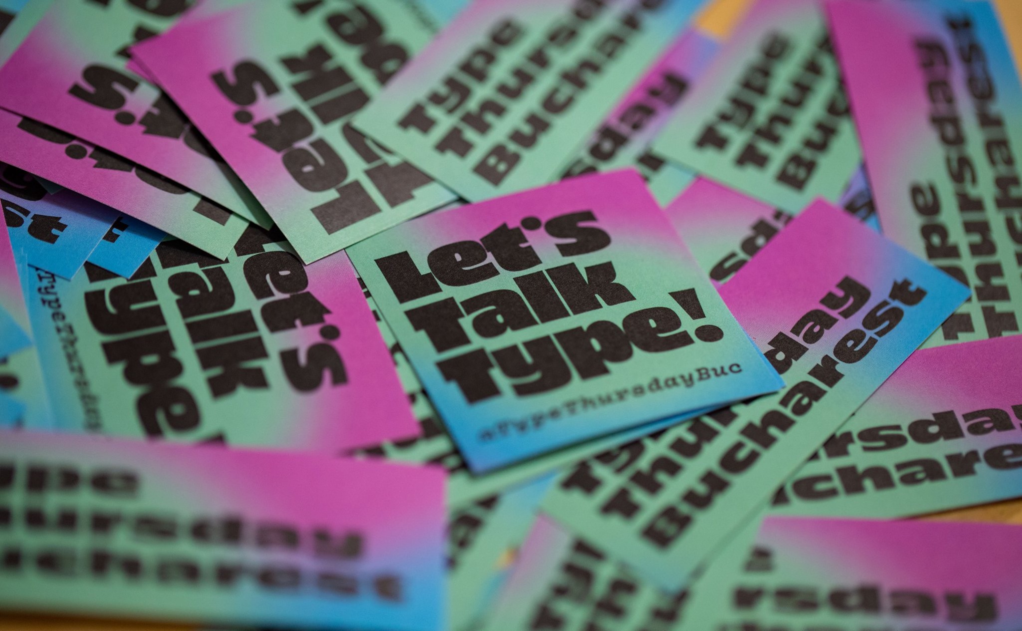
Mai 2019 — Type Thursday BUC
En →
19-23
Mai
9
Iun
19-23
Mai
9
Iun
Practice free writing.
By no means a perfect approach, much rather, a clearing of the cache drawer, making room for the new. In a few words this is what drawing a typeface was about here.
Also this is fueled by getting back to nature, going full freelance and managing a small digital foundry, finding time for other things like cycling, or gardening, planting and pruning trees, listening to the old folks, trekking in the backyard. Getting involved in domestic activities & including that in the process.
When starting design on a new typeface, I usualy like to draw and redraw some of the letters that could give its character and let them be for a while. Then if you still want to meet the family, it might be a good idea to pursue it further. Thankfuly this here seems to have been such a case.
It began when I found an old magazine cover while browsing online. A magazine cover from an old Romanian publication called România Pitorească. In the context of that moment it fitted like a glove as I was descovering also the exploits of a group of people that took to hiking some of the local trails and mountains while documenting where they went and what they saw in these parts of the world. I found inspiration in that and thought it would make for a good project. Did a little research to see what else I could find, in terms of letters, or existing fonts on this subject. The amount of information that I found to be available online on old Romanian publications was small though so that I decided to get in, trace and reinterpret the two capital letters that initially caught my eye.
Ro →
Practică scrisul liber.
Nu este deloc o abordare perfectă, mai degrabă o curățare a sertarului de cache, făcând loc noului. În câteva cuvinte, ce a însemnat desenarea unui font aici.
De asemenea, acest lucru este alimentat de revenirea la natură, la activitate independentă, gestionarea unei mici fonderii digitale, găsirea timpului pentru alte lucruri, cum ar fi ciclismul, grădinăritul, plantarea și tunsul copacilor, ascultarea bătrânilor, trekking prin curtea din spate. Implicarea în activități casnice și incorporearea acestora în procesul de lucru.
Când încep proiectarea unui nou font, de obicei prefer să desenez și redesenez câteva dintre literele care i-ar putea da caracterul și le las deoparte pentru o vreme. Dacă tot dorești să cunoști familia apoi, ar fi o idee bună să continui. Din fericire, acest exemplu pare să fi fost un astfel de caz.
Proiectul a început când am găsit o copertă veche de revistă în timp ce navigham online. O copertă de revistă de lao veche publicație românească intitulată România Pitorească. În contextul acelui moment, se potrivea ca o mănușă, în timp ce descoperisem și exploatările unui grup de oameni care se luau la drumeții pe unele din traseele și munții locali, documentând unde au mers și ce au văzut în aceste părți ale lumii. Mi-am găsit inspirația în asta și m-am gândit că va face un proiect bun. Am făcut puțină cercetare pentru a vedea ce altceva pot găsi, în termeni de litere sau fonturi existente pe această temă. Cantitatea de informații pe care am găsit-o ca fiind disponibilă online pe publicații vechi românești a fost mică, astfel am decis să mă apuc de lucru direct, să trasez și reinterpretez cele două litere majuscule care mi-au atras atenția inițial.
En →
OTC Riga is a study and interpretation of a slab-serif, italic, Clarendon, designed for the rendering of titles and/ or lines of visibly different cut text.
Ro →
OTC Riga este un studiu și interpretare a unui Clarendon, un slab-serif, italic, desemnat pentru redare de titluri și/ sau câteva rânduri de text cu aspect deosebit.


Photos © Mihai Militaru, Adi Marineci & Elisabeta Kindriș
†