

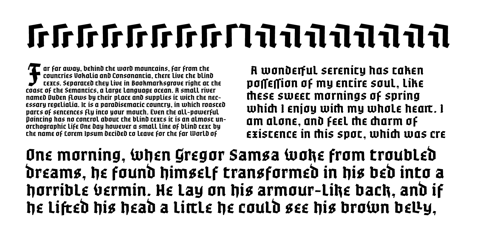
OTC Textura
7 Iul 2025
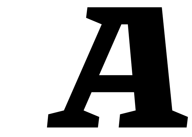
Contemporary, simplified blackletter typeface inspired by volumetric signage.
The whole design process and decisions were influenced by the process of making volumetric letters for signages using CNC and aluminium profile bending machines.
The letter shapes were thought out and constructed with very little contrast or modulation in the strokes while keeping a rather strict calligraphic flow in order to deliver a sturdy object that can be easily assembled and that can weather the elements.
The letter shapes were thought out and constructed with very little contrast or modulation in the strokes while keeping a rather strict calligraphic flow in order to deliver a sturdy object that can be easily assembled and that can weather the elements.
One style: blackletter
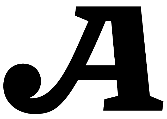
Various stylistic and contextual alternates, and a considerable amount of ligatures and more.
Language support for: Basic Latin, Western, Central & Eastern European languages.
![]()
Various stylistic and contextual alternates, and a considerable amount of ligatures and more.
Language support for: Basic Latin, Western, Central & Eastern European languages.

.notdef


Desktop License
OTC Textura
Price / Number of User
Web License
OTC Textura
Price / Page views per month

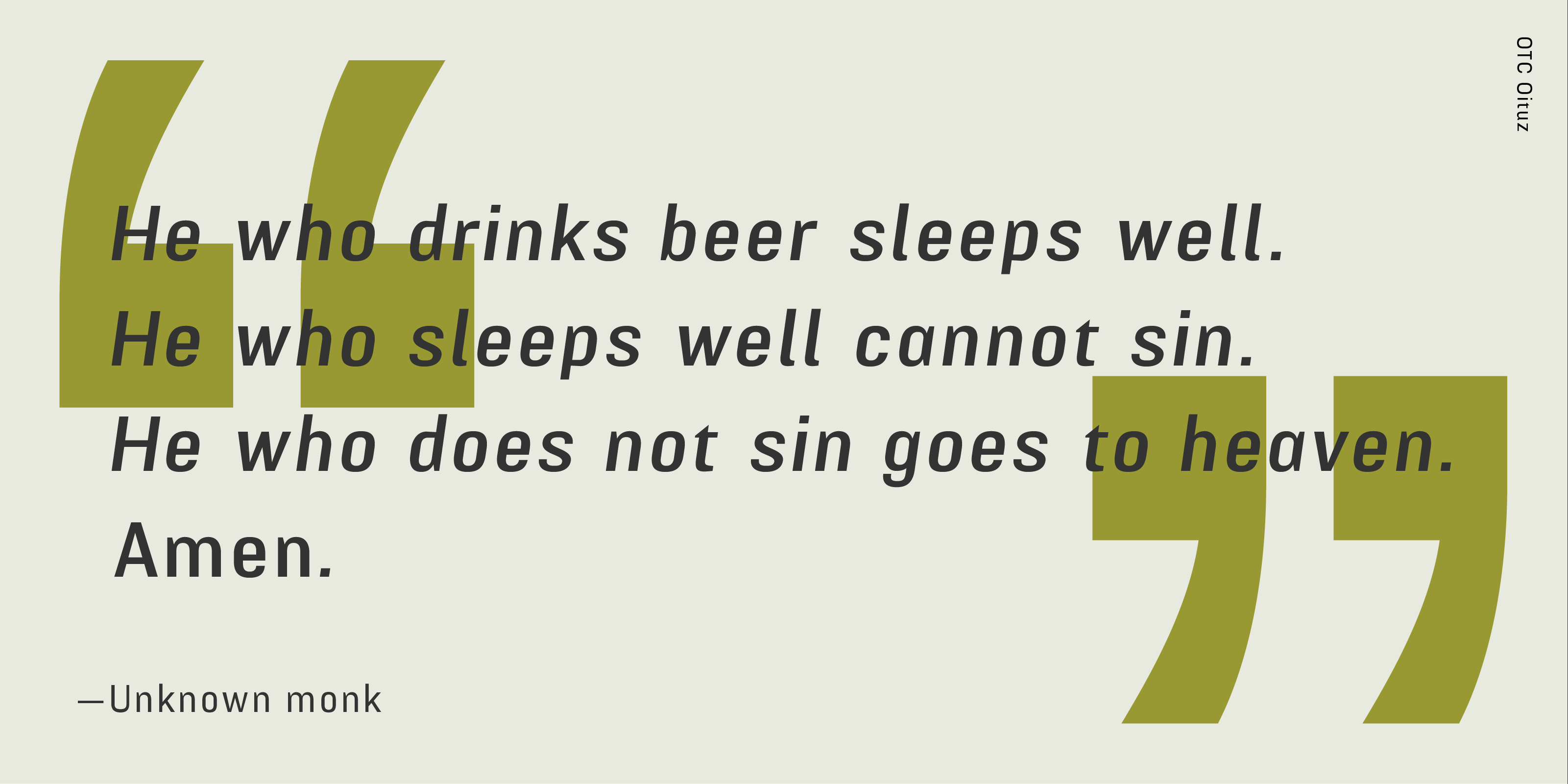
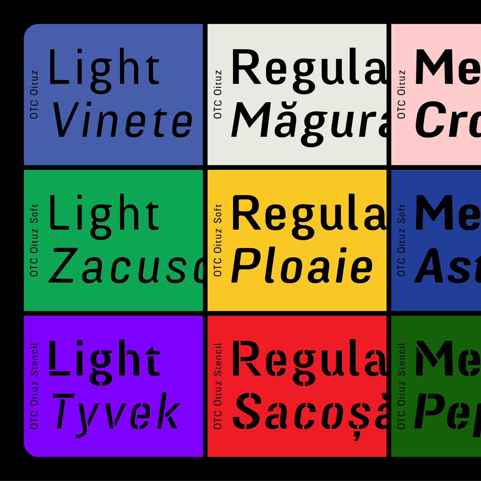
OTC Oituz
OTC Oituz is a modulated sans that shares some of its skeleton with OTC Eugen.
With an improved calligraphic approach in letter drawing and spacing, OTC Oituz is loosely inspired by wood type grotesks with an utilitarian focus. The family grows in weight quite abruptly, yet manages to occupy the same width on the line, aiding expressivity in tight spaces. With the exception of the stencil cut it features a mono-weight design which improves type setting. It comes in five weights accompanied by obliques across the regular, soft and stencil versions. It has a few aces up its sleeve despite its simple, geometric appearance and is ideal for clean and striking communication.
The family is comprised of five weights, from light to black with accompanying obliques, while the extented family welcomes also a stencil cut as well as a soft cut.
Five styles sans family with obliques, stencil and rounded versions available.
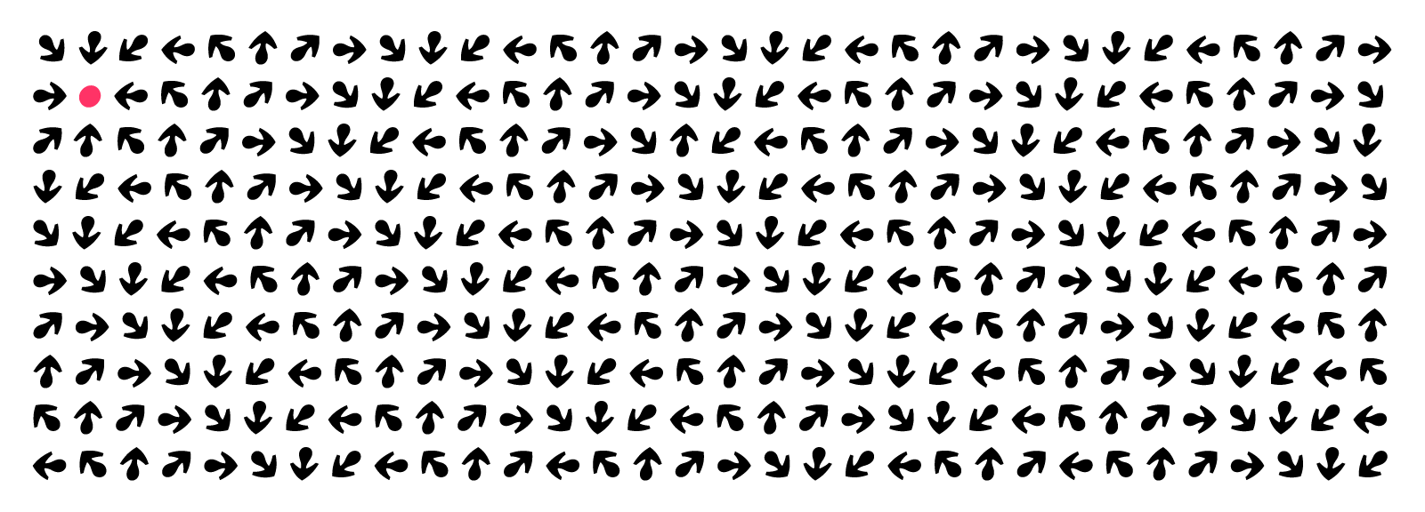
Various stylistic and contextual alternates, and a considerable amount of ligatures, arrows and more.
Language support for: Basic Latin, Western, Central & Eastern European languages.
![]()
Various stylistic and contextual alternates, and a considerable amount of ligatures, arrows and more.
Language support for: Basic Latin, Western, Central & Eastern European languages.


Desktop License
OTC Oituz
Regular
Price / Number of User
Web License
OTC Oituz
Regular
Price / Page views per month

OTC Pebbles
OTC Pebbles is a playground! The thing that jumps at you at first is probably its clumsiness, the way letters are drawn. It might even evoke wood type you once saw somewhere and might not be wrong about it. Yet the complete lack of any curved lines, it's stockiness has that “Bam! Bam!” quality to it.
In all fairness, it's a display face. It has character and it puts it on display.
In all fairness, it's a display face. It has character and it puts it on display.
One weight: Fat.
Stylistic alternates, an array of ligatures.
Language support for: Basic Latin, Western, Central & Eastern European languages.
Stylistic alternates, an array of ligatures.
Language support for: Basic Latin, Western, Central & Eastern European languages.

Better days are here again!

Dark yet funky, features a growing list of uppercase ligatures.


Go wild and make your own!
Desktop License
OTC Pebbles
Individual Style
Price / Number of Users
Web License
OTC Pebbles
Individual Style
Price / Page views per month
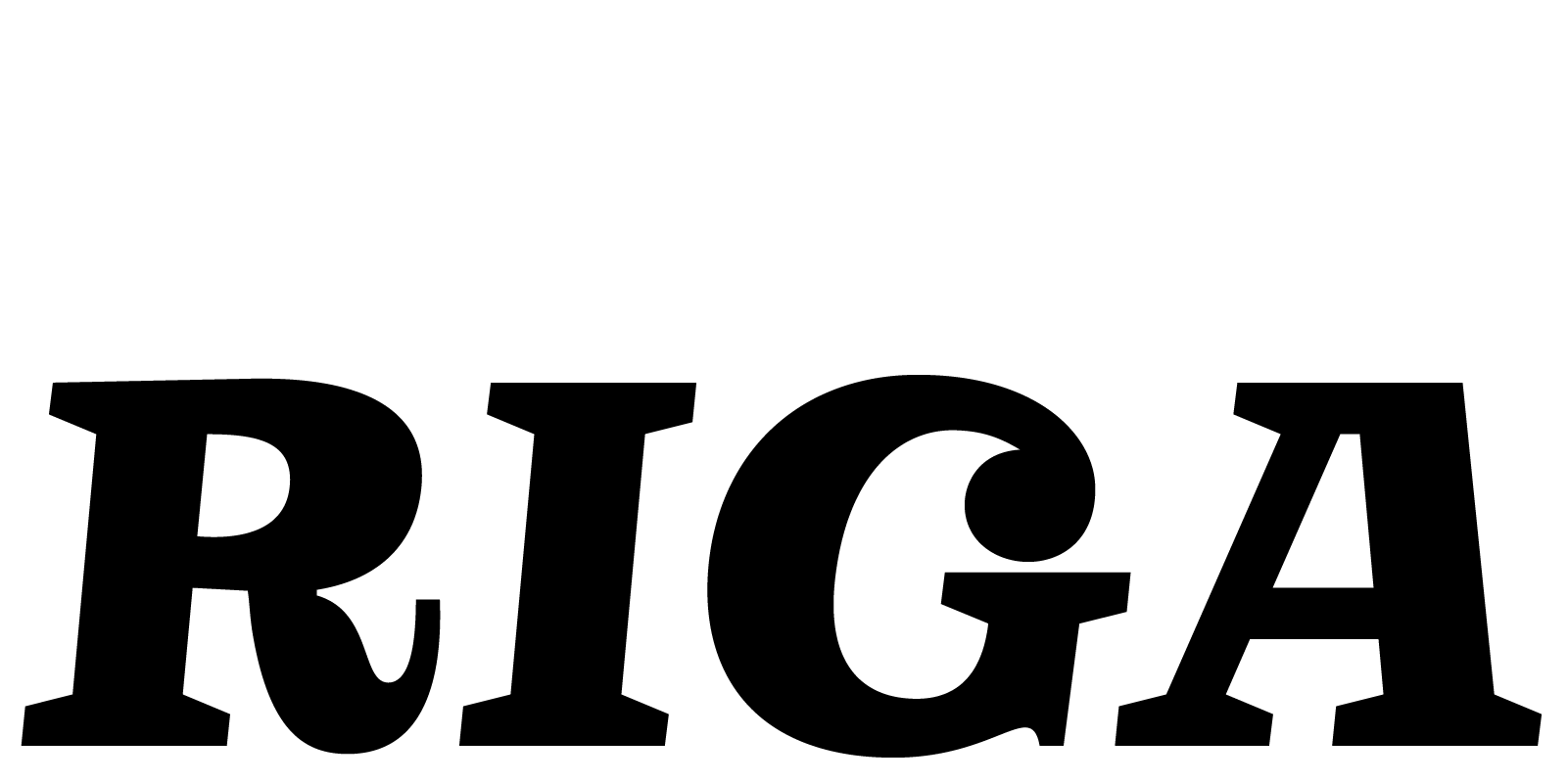
OTC Riga
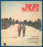
OTC Riga is an interpretation of an italic wood type era slab serif or Clarendon. Inspired by a România Pitorească Magazine cover from January ‘72.
This typeface was developed from the monogramed magazine’s cover title (R&P), which stood as starting point, as well as other period and/ or style specific examples.
↑ Actual size ↑
One weight: Bold.
Stylistic alternates.
Language support for: Basic Latin, Western, Central & Eastern European languages.
Stylistic alternates.
Language support for: Basic Latin, Western, Central & Eastern European languages.
You are here! now…

Three main stylistic sets and lots more alternates and ligatures to express your text in the best possible way.

Romanian Language specific ligatures!
Some Capitals have swashes!


Play around, you won’t break it!

Never watch bad TV! Again…
Desktop License
OTC Riga
Individual Style
Price / Number of Users
Web License
OTC Riga
Individual Style
Price / Page views per month

OTC Escu
OTC Escu Grotesc Lat is a quirky classical grotesque type family with four optical weights inspired by a wood panel cutout found on an old typical mountain side house from Dambovita County, Romania. On the panel the cut-out letters spell tipically the year of the build, and the name of the proprietor.
Four weights:
Light, Regular, Medium & Bold.
Available as Variable Font.
Stylistic alternates.
Language support for: Basic Latin, Western, Central & Eastern European languages.
Light, Regular, Medium & Bold.
Available as Variable Font.
Stylistic alternates.
Language support for: Basic Latin, Western, Central & Eastern European languages.

Comes in four optical weights — heavy on the horizontal axis.
Quirky to say the least.

Feels almost monospaced, yet it isn’t.

Give it a go! Wow!

Something I heard someone once say.
Desktop License
OTC Escu
Family Package
Price / Number of Users
Web License
OTC Escu
Family Package
Price / Page views per month
OTC Escu
Light
Price / Number of Users
OTC Escu
Regular
Price / Number of Users
OTC Escu
Medium
Price / Number of Users
OTC Escu
Bold
Price / Number of Users
Light
Price / Number of Users
OTC Escu
Regular
Price / Number of Users
OTC Escu
Medium
Price / Number of Users
OTC Escu
Bold
Price / Number of Users
OTC Escu
Light
Price / Page views per month
OTC Escu
Regular
Price / Number of Users
OTC Escu
Medium
Price / Number of Users
OTC Escu
Bold
Price / Number of Users
Light
Price / Page views per month
OTC Escu
Regular
Price / Number of Users
OTC Escu
Medium
Price / Number of Users
OTC Escu
Bold
Price / Number of Users