
„Toate-s vechi și nouă toate”
Colecție de imagini, proces, evenimente cu și despre litere.
Oct 2022 – Graphic Days București – Keynote presentation

Mar 2021 – OTC Pebbles – Notes on design

En →
14
Mar
14
Mar
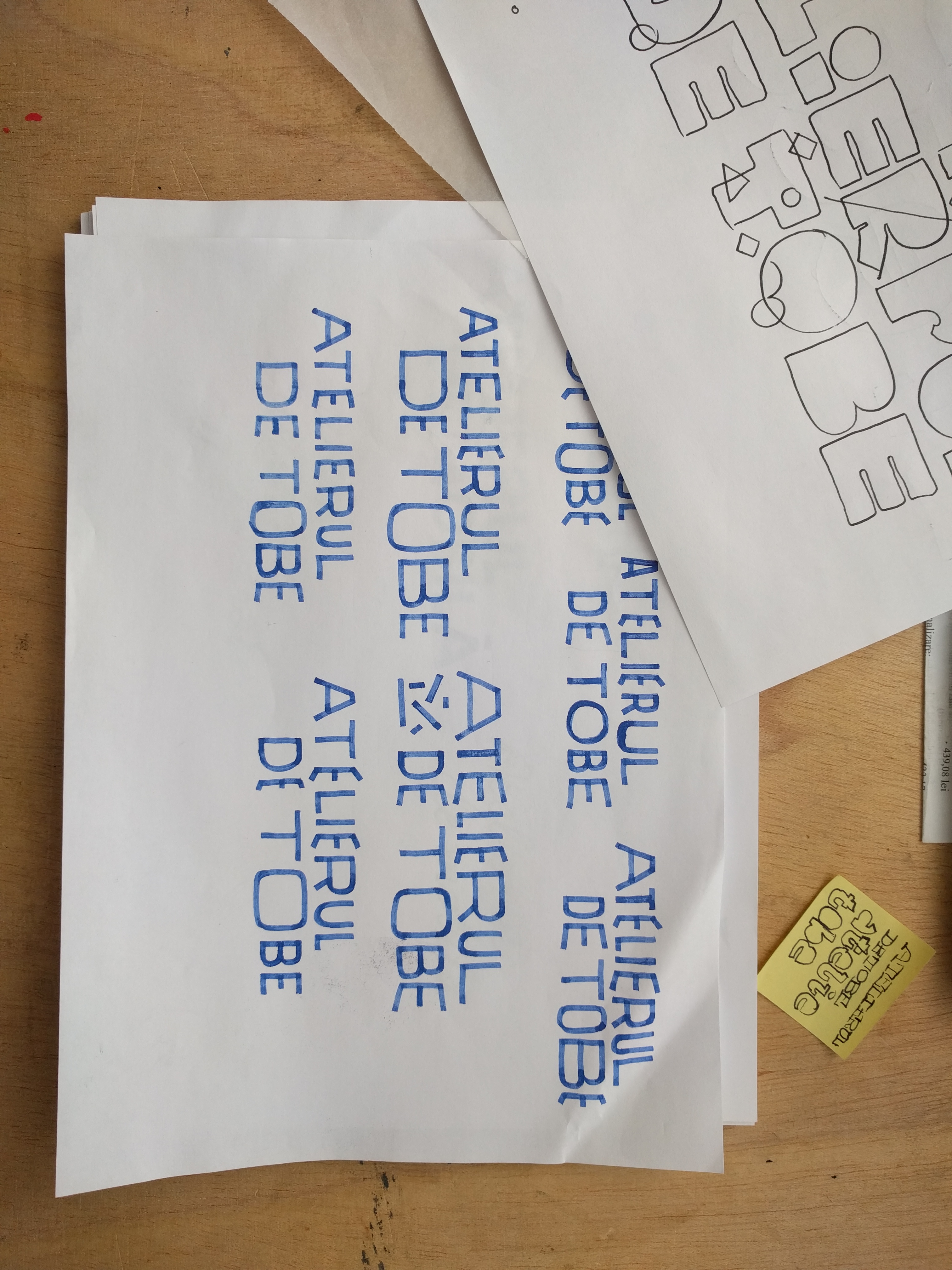
Like some of the fonts developed in the past, this one also had as a starting point the lettering work produced for a branding project.
I am referring here to the Atelier de Tobe whose identity seeks to capture the raw energy, vibration, color and rhythms of percussion instruments. In order to capture the sound impact rather, we considered, at the time, that curved lines may be missing from the construction of letters. Also the distance in time that the sound travels was a decisive factor in the interpretation of the forms.
But here we were talking about a handful of characters. The intention to further develop it into a working typeface existed from the beginning.
In drawing the characters I tried to keep the same approach; rendering the letter shape using only straight lines, working fast, digitally. It wasn't long before an almost complete set of characters began to take shape.
During the process each letter underwent changes. Character spacing was important to establish well in the begining. This was a bit more relaxed at the start, yet, considering that the font is a display, I finally decided to bring the letters closer together.
It's been a playground! The most notable thing that you first notice is probably its clumsiness, the way letters are drawn. It might even evoke wood type you once saw somewhere and you might not be wrong about it. Yet the complete lack of any curved lines, it's stockiness has that “Bam! Bam!” quality to it.
In all fairness, it's a display face. It has character and it puts it on display. Having been extrapolated out of the lettering done for Atelierul de Tobe wordmark it was bound to be loud.
Practical might be a lot to call it, but at least covering a wide possible range of needs, by providing a few more ligatures than you might have been expecting, lowercase as well as upper. Some extra characters and alternates to spice things up. Numbers of all kinds, including old-style and tabular; fractions - though I don't know whom might be using them except for the difference in design. All the bells and whistles you could possibly use in terms of punctuation and symbols are there too.
The visual structure of the design is in part due to the way it is constructed, the fast placing of nodes and mainly drawing from memory without much filter. And in second part due to spacing, spaghetti westerns and the sixties' surf culture, as can be found in some of the interlocking uppercase ligatures.
Ro →
Precum o parte dintre fonturile dezvoltate în trecut, acesta, de asemenea a avut ca punct de plecare o lucrare de lettering produsă pentru un proiect de branding.
Mă refer aici la Atelierul de Tobe a cărei identitate caută să surprindă energia brută, vibrația, culoarea și ritmurile instrumentelor de percuție. Pentru a captura impactul sonor mai degrabă, am considerat la momentul respectiv, că liniile curbe pot lipsi din construcția literelor. De asemenea distanța în timp pe care o parcurge sunetul a fost un factor decisiv în interpretarea formelor.
Vorbim aici însă de o mână de caractere. Intenția de a dezvolta mai departe o față funcțională a existat încă de la început.
În desenul caracterelor am căutat să păstrez aceeași abordare; redarea formei literei folosind doar linii drepte, lucrând rapid, digital. Nu a durat mult până când un set aproape complet de caractere a început să prindă formă.
De-a lungul procesului fiecare literă a suferit modificări. Spațierea caracterelor a fost important de stabilit bine încă de la început. Inițial era mai relaxată, având în vedere însă că fontul este un display am decis în cele din urmă să aduc literele mai aproape.
A fost un loc de joacă! Cel mai notabil lucru pe care îl observați pentru prima dată este probabil stângăcia construcției, felul în care sunt desenate literele. S-ar putea chiar evoca litere de lemn pe care le-ai văzut cândva și s-ar putea să nu te înșeli cu privire la asta. Cu toate acestea, lipsa completă a oricăror linii curbe, aspectul bondoc are aceea “Bam! Bam!” calitate.
În mod corect, este o față de afișare. Are caracter și îl arată. După ce a fost extrapolat din literele făcute pentru semnul-cuvânt al Atelierului de Tobe, acesta nu putea să nu fie gălăgios.
Practic ar putea fi mult să-l numim, dar cel puțin acoperind o gamă largă posibilă de nevoi, oferind câteva legături mai multe decât v-ați fi așteptat, atât minuscule, cât și majuscule. Câteva caractere suplimentare și alternative pentru a condimenta lucrurile. Numere de tot felul, inclusiv stil vechi și tabel; fracțiuni - deși nu știu cine ar putea să le folosească, cu excepția alegerii aspectului diferit. Toți clopoțeii și fluierele pe care le-ați putea folosi în termeni de punctuație și simboluri sunt și ele acolo.
Structura vizuală a designului se datorează în parte modului în care este construit, plasării rapide a nodurilor și, în principal, extragerii din memorie fără prea mult filtru. Și în a doua parte, datorită spațierii, spaghetti westernurilor și culturii de surf din anii șaizeci, așa cum se poate observa la unele legături majuscule interconectate.
![]()
![]()
![]()
Mă refer aici la Atelierul de Tobe a cărei identitate caută să surprindă energia brută, vibrația, culoarea și ritmurile instrumentelor de percuție. Pentru a captura impactul sonor mai degrabă, am considerat la momentul respectiv, că liniile curbe pot lipsi din construcția literelor. De asemenea distanța în timp pe care o parcurge sunetul a fost un factor decisiv în interpretarea formelor.
Vorbim aici însă de o mână de caractere. Intenția de a dezvolta mai departe o față funcțională a existat încă de la început.
În desenul caracterelor am căutat să păstrez aceeași abordare; redarea formei literei folosind doar linii drepte, lucrând rapid, digital. Nu a durat mult până când un set aproape complet de caractere a început să prindă formă.
De-a lungul procesului fiecare literă a suferit modificări. Spațierea caracterelor a fost important de stabilit bine încă de la început. Inițial era mai relaxată, având în vedere însă că fontul este un display am decis în cele din urmă să aduc literele mai aproape.
A fost un loc de joacă! Cel mai notabil lucru pe care îl observați pentru prima dată este probabil stângăcia construcției, felul în care sunt desenate literele. S-ar putea chiar evoca litere de lemn pe care le-ai văzut cândva și s-ar putea să nu te înșeli cu privire la asta. Cu toate acestea, lipsa completă a oricăror linii curbe, aspectul bondoc are aceea “Bam! Bam!” calitate.
În mod corect, este o față de afișare. Are caracter și îl arată. După ce a fost extrapolat din literele făcute pentru semnul-cuvânt al Atelierului de Tobe, acesta nu putea să nu fie gălăgios.
Practic ar putea fi mult să-l numim, dar cel puțin acoperind o gamă largă posibilă de nevoi, oferind câteva legături mai multe decât v-ați fi așteptat, atât minuscule, cât și majuscule. Câteva caractere suplimentare și alternative pentru a condimenta lucrurile. Numere de tot felul, inclusiv stil vechi și tabel; fracțiuni - deși nu știu cine ar putea să le folosească, cu excepția alegerii aspectului diferit. Toți clopoțeii și fluierele pe care le-ați putea folosi în termeni de punctuație și simboluri sunt și ele acolo.
Structura vizuală a designului se datorează în parte modului în care este construit, plasării rapide a nodurilor și, în principal, extragerii din memorie fără prea mult filtru. Și în a doua parte, datorită spațierii, spaghetti westernurilor și culturii de surf din anii șaizeci, așa cum se poate observa la unele legături majuscule interconectate.


Schițe inițiale pentru Atelierul de tobe


↖ Atelier de Tobe
wordmark lettering
wordmark lettering

Glyphs panel screen grab ↓