
En →
26 – 28 Feb
26 – 28 Feb
As it happens, books from other books are written. I’m sure there’s no surprise to you, dear reader, that the same applies to typeface design.
Ro →
Cum se întâmplă, cărțile din cărți sunt scrise. Sunt sigur că nu e o surpriză pentru tine, dragă cititor, că același lucru e valabil și pentru designul de fonturi.
†
One of the first encounters I’ve had with a condensed gotic face, in these parts of the world, which would later draw me to design a personal version, was in the summer of 2017.
It was August and the air quite thick and hard to breath. I have just stepped out of the office I was then working at to get a refreshing ice-cream break from the corner store.
That’s where I found it, this good looking No Parking sign. It might have been meant to remind passer-bys, quick stoppers, or any other vehicle for that matter that the space was reserved for supplying the shop. As far as an attention grabbing sign goes, I guess this one kind of blended in remarcably well with its surroundings, white sign on a white wall. The store, a butcher’s shop slash deli, seemed to be about as old, or even more so, as the plaque.
Una dintre primele întâlniri cu o față gotică condensată, în aceste părți ale lumii, care mai târziu m-ar atrage să proiectez o versiune proprie, a fost în vara anului 2017.
Era August, iar aerul destul de gros și greu de respirat. Doar ce am ieșit din biroul la care lucram atunci pentru o pauză răcoritoare de înghețată de la magazinul din colț.
Acolo l-am găsit, acest semn de Nu Parca.
Ar fi fost menit să reamintească trecătorilor, staționatorilor, sau oricărui alt vehicul de altfel, că acel spațiu a fost rezervat pentru aprovizionarea magazinului. În ceea ce privește un semn de atragere a atenției, cred că acesta se confunda remarcabil de bine cu împrejurimile sale, semn alb pe un perete alb. Magazinul, o măcelarie / alimentară, părea să fie la fel de vechi, sau chiar mai bine, precum placa.
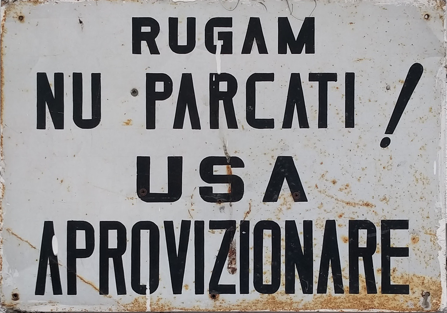
It still is a rusty old sign, hand made by who knows who…
Getting back on track, I found it to be stricking.
There are a few things to notice here: like the barless A’s for one. That jumps right at you. Which, as far as a theory goes, could very well be some upside down V’s. Then there are the square shaped counters on those tall P and R on the second line, in the word PARCATI. The varying widths and the consistency of stroke on all the letterforms. On the first word, RUGAM, on which the M takes a deep dive to release a whole lot of negative space from its nadir. As a side and rather conceptual note here, it does make it look somewhat humble and soft spoken. Then on the third line the three letters making up the word for door (USA), that stand wider, yet the structural, geometric build of it is still there. And on the last word, APROVIZIONARE the characters get compressed together in comparison, taller and tighter spaced, yet the details would suggest they are all a part of the same type family. It made me wonder if this was a typeface after all.
Went by the shop again and enquired about who has done it, yet so far you know about as much as I do.
In my opinion, this was probably done by someone that took pride in their work. That is clearly visible in the structure of the sign, the design, typography, the hand made quality of a straight forward message delivered with ease and promptness.
Yes, that exclamation mark (!) that is something else. As to the the nature of the process, I would venture to say that the letters were rather simply drawn with a pencil (notice the fine vertical line enclosing the counters of the last letter E) and most likely rendered with a brush on the metal plate.
All in all, I would say it is definitely a good sign, a mark of craftmanship; as to the existence of an existing typeface that was used as base, that is probably not the case, the letters here were at best constructed using common sense, hands-on shop experience and basic geometry.
Este încă un semn vechi ruginit, făcut de mâna cine știe cui…
Înapoi la treabă, l-am găsit remarcabil.
Sunt câteva lucruri pe care le poți observa aici: cum ar fi A-ul fără bară orizontală pentru început. Îți sare chiar în ochi. Care, în măsura în care s-ar putea emite o teorie, ar putea fi foarte ușor un V cu susul în jos, întors pe dos. Apoi, sunt spațiile interioare (counter) în formă de pătrat pe acel P și R înalte de pe a doua linie, în cuvântul PARCATI. Diferitele lățimi și consistența tușei pe toate literele prezente. La primul cuvânt, RUGAM, unde M se scufundă adânc pentru a elibera o grămadă de spațiu negativ din nadirul său. Ca o notă laterală și mai degrabă conceptuală, îl face să arate oarecum umil și vorbit domol. Apoi, în a treia linie, cele trei litere care alcătuiesc cuvântul ușă, ce stau extinse, cu construcție geometrică, aceeași structura este încă acolo. Și în ultimul cuvânt, APROVIZIONARE literele se comprimă împreună, în comparație, mai înalte și mai strânse, aceleași detalii ar sugera totuși că toate fac parte din aceeași familie. M-a făcut să mă întreb dacă în cele din urmă era vorba despre un font.
Am mers din nou la magazin și am întrebat cine a făcut semnul, dar până acum știi cam la fel de multe ca și eu.
După părerea mea, acest lucru a fost probabil realizat de cineva care s-a mândrit cu munca sa. Acest lucru este clar vizibil în structura semnului, designul, tipografia, calitatea manuală a unui mesaj direct livrat cu ușurință și promptitudine.
Da, acel semn de exclamare (!) Este altceva. În ceea ce privește natura procesului, aș îndrăzni să spun că literele au fost pur și simplu trasate cu un creion (observați linia verticală fină care cuprinde spațiile interioare ultimei litere E) și, cel mai probabil, redată cu o pensulă pe placa metalică.
Toate ca toate, aș spune că este cu siguranță un semn bun, o marcă a meșteșugului; în ceea ce privește prezența unui font existent ce a fost folosit ca bază, probabil că nu este cazul aici, literele de aici au fost redate cel mai probabil folosind bun simț, experiență practică de atelier și geometrie de bază.
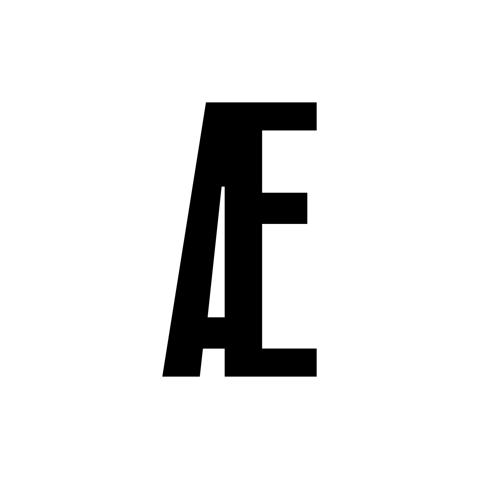
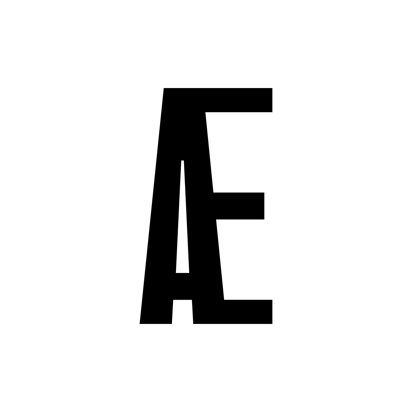

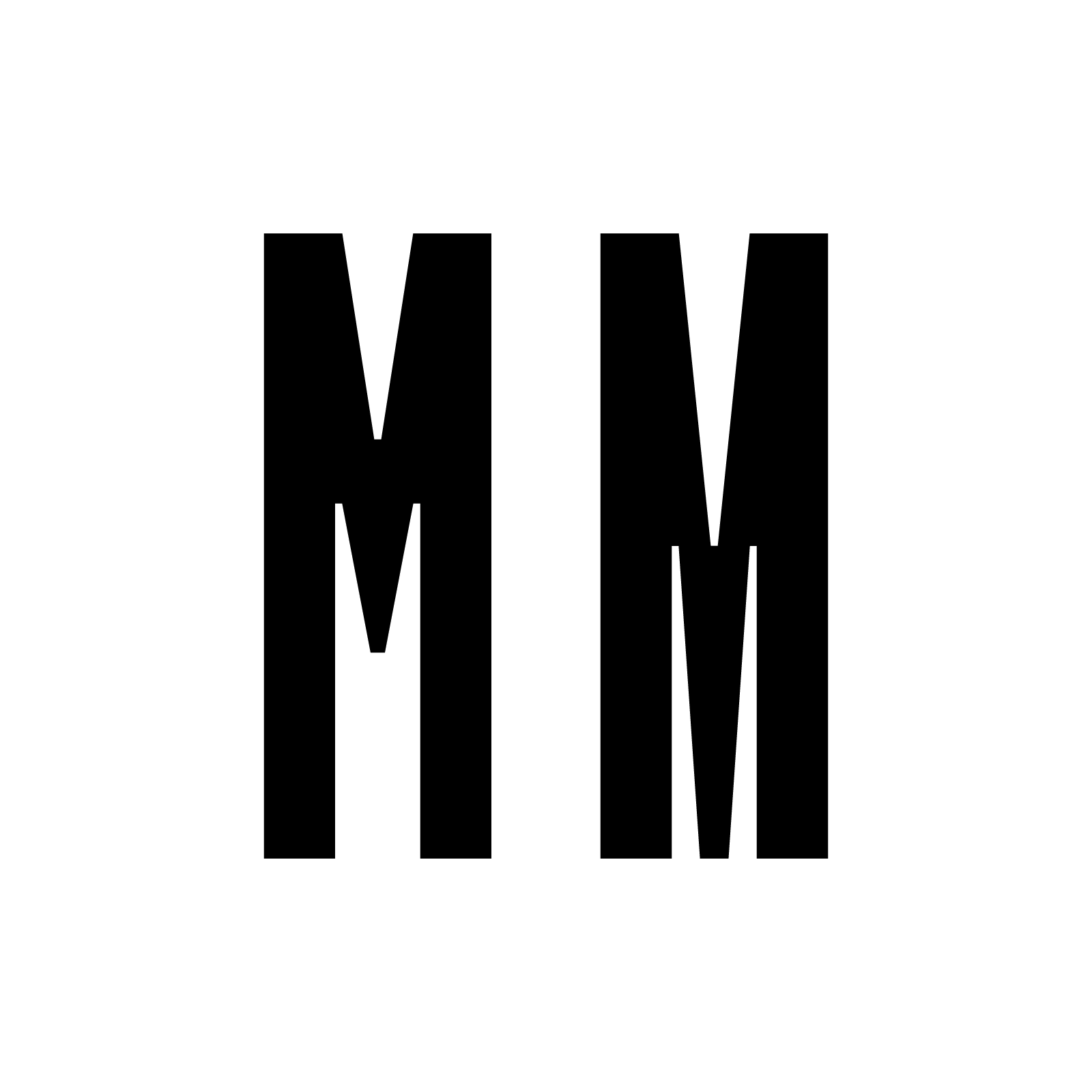
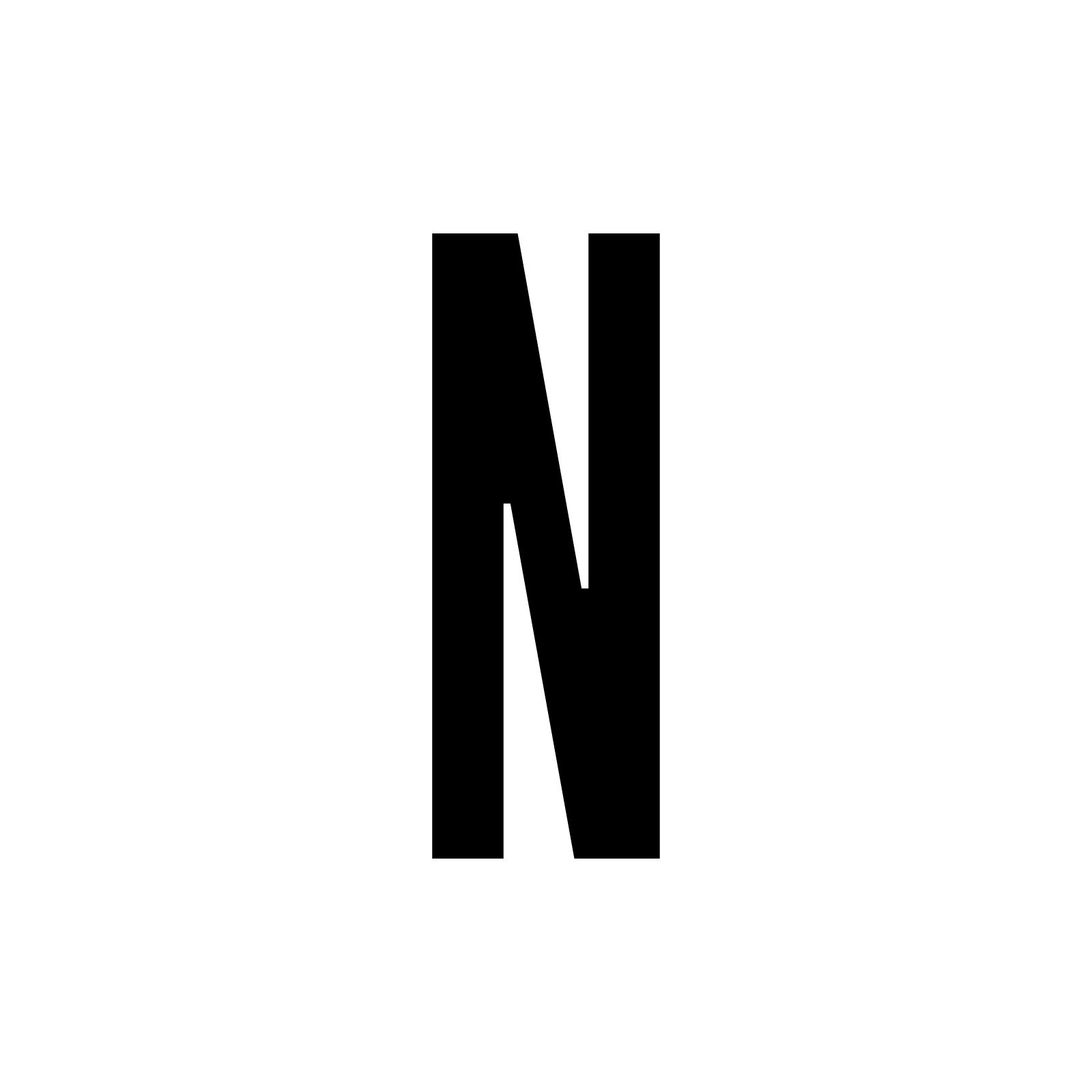
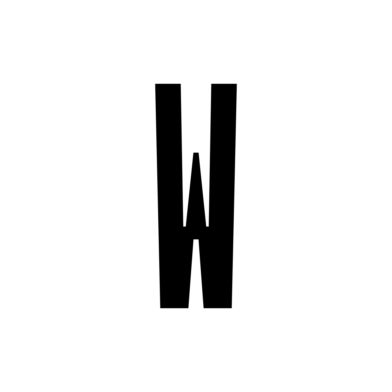
↘ Glyph comparison: Æ, E, F and M along with alternates; M, N and W have slightly thinner stems as to fit in the same width space.
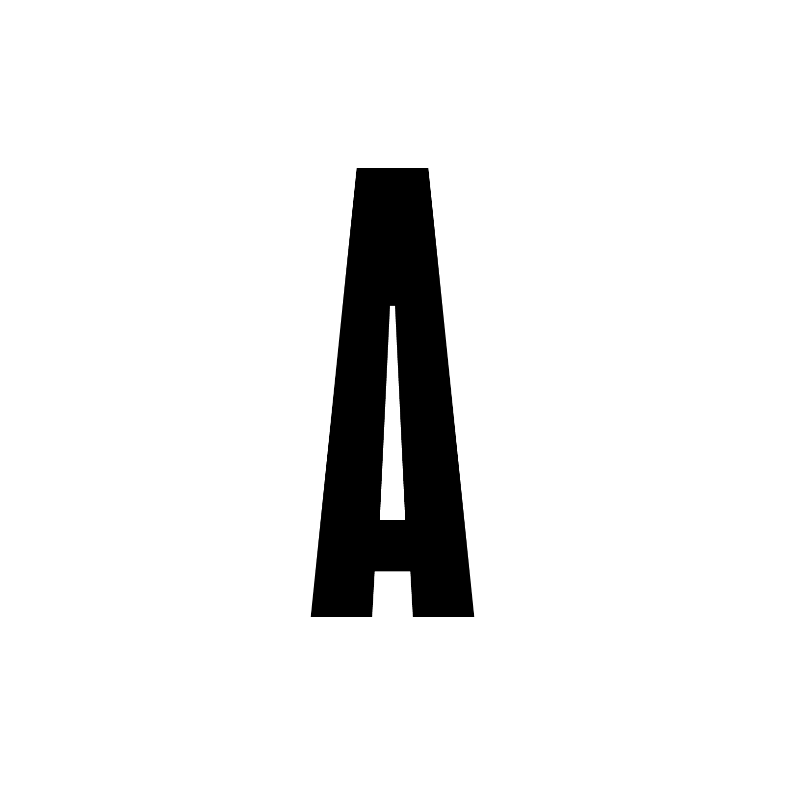
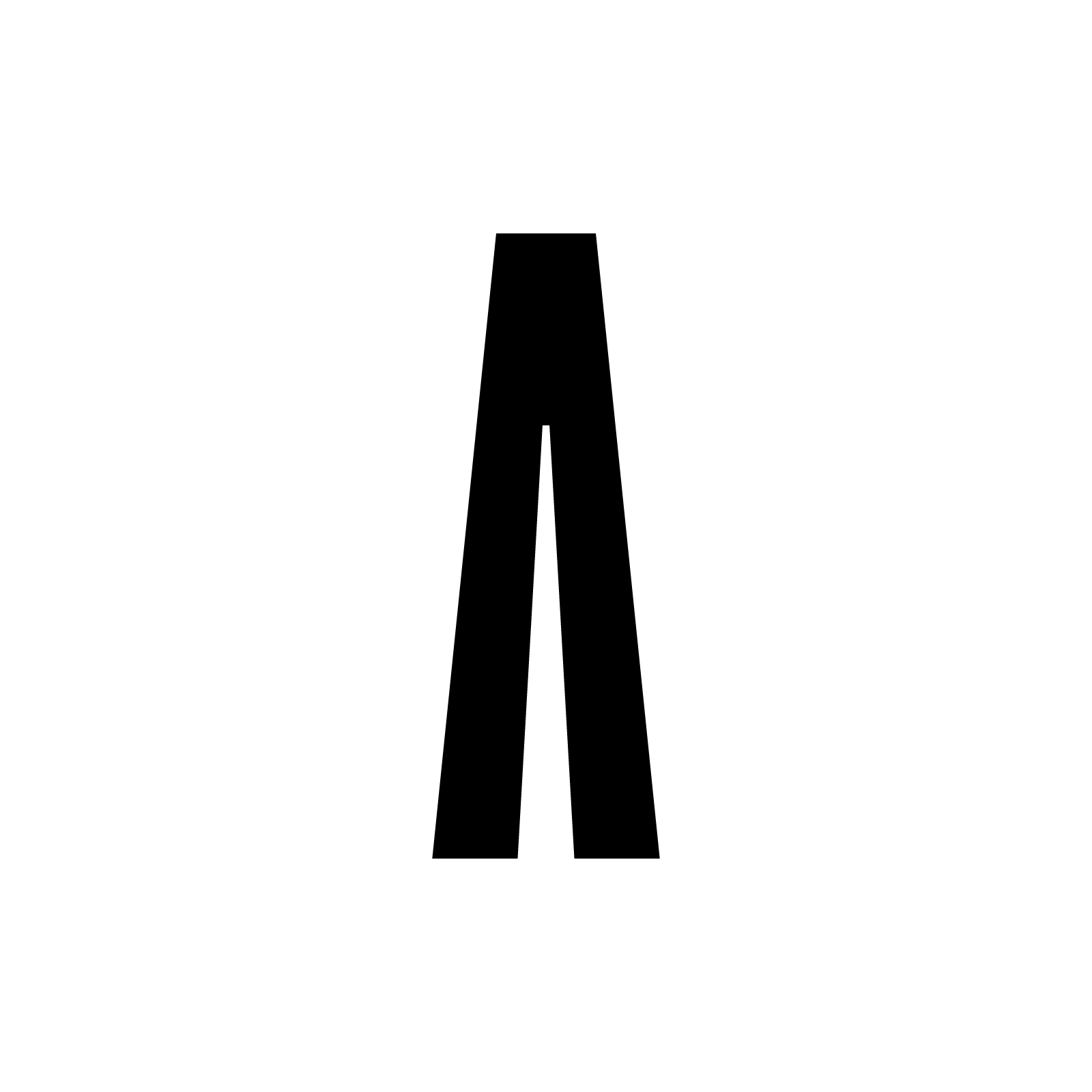
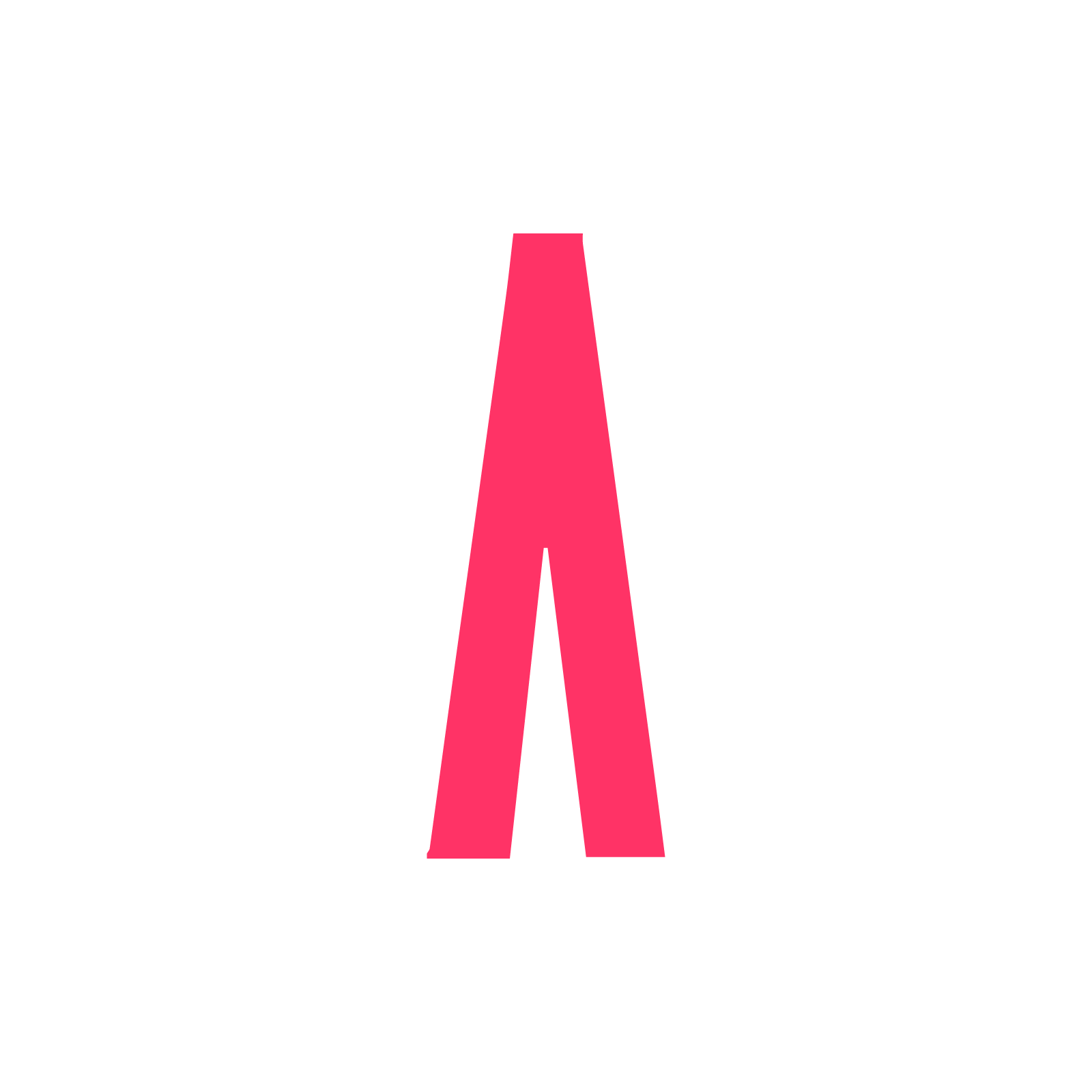

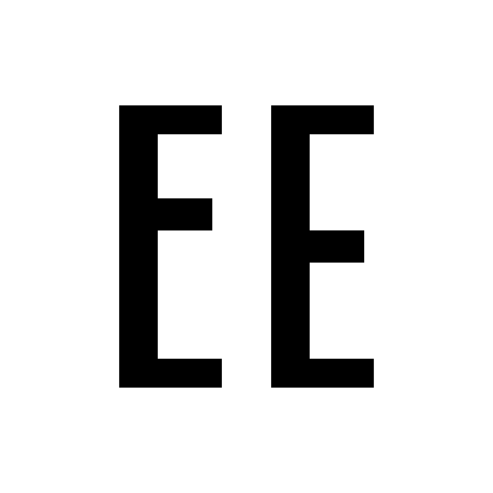
↖ Glyph comparison: Standard A, Barless A (added as alternate), Pink A (from APROVIZIONARE, above), Blue A (from TELEENCICLOPEDIA, below).
††
Fast forward [»] to May of next year (2018).
An afternoon beer, a distant relative, an odd talk about work and prospects, when some unforgettable piano notes of one musical moment that has the power to transport me back to my childhood grabbed my attention.
We were both low-key showing off work projects and I guess the typeface I was working on reminded my cousin about this title sequence I was sent to watch. It was, of course, for those of you in the knowing, the opening to one of the most awaited TV shows back in the ‘80s — [ ︎ ]
Pe repede înainte [»] spre luna Mai a anului următor (2018).
O bere la după-amiază, o rudă îndepărtată, o discuție aparte despre muncă și perspective, când unele note de pian de neuitat ale unui moment muzical care are puterea să mă transporte în copilărie mi-au atras atenția.
Amândoi ne lăudam vag modest cu proiecte de lucru și cred că fontul la care lucram i-a amintit vărului meu de această secvență de titlu pe mi-a trimis-o să o urmăresc. Era, bineînțeles, pentru cei cunoscători, deschiderea la una dintre cele mai așteptate emisiuni TV din anii '80 —

TV show title lockup
The similarities were stricking, I must admit. And it made me revisit some of the my design decisions, like placement of bars for one, that can be noticed now in characters like Æ, E and F, that I have kept as alternates and that feature a half-way up vertical crossbar.
However, one of the decisions I have made ealry on in the process was to try and make this grotesque condensed into a monospaced font and that made all the difference. It turned out to be quite a problematic task that led to some head scratching on my part. How was I to design, in the same width space, characters like A, M, W, to name just a few? Even keeping N away from the dark path was challenging. I was definitely not that happy with myself for it, but I stood by it, for the better.
However, one of the decisions I have made ealry on in the process was to try and make this grotesque condensed into a monospaced font and that made all the difference. It turned out to be quite a problematic task that led to some head scratching on my part. How was I to design, in the same width space, characters like A, M, W, to name just a few? Even keeping N away from the dark path was challenging. I was definitely not that happy with myself for it, but I stood by it, for the better.
Asemănările erau neașteptate, trebuie să recunosc. Și m-a determinat să revizuiesc câteva dintre deciziile mele de proiectare, cum ar fi plasarea barelor orizontale, ce poate fi observată acum la litere precum Æ, E și F, pe care le-am păstrat ca alternative și care au o bară verticală la jumătatea distanței verticale.
Cu toate acestea, una dintre deciziile pe care am luat-o timpuriu în acest proces a fost încercarea de a face ca acest grotesc condensat să fie un font monospațiat, iar asta a făcut toate diferența. S-a dovedit a fi o sarcină destul de dificilă care mi-a provocat ceva bătăi de cap. Cum aveam să proiectez, în același spațiu în lățime, litere ca A, M, W, pentru a numi doar câteva? Chiar păstrând N departe de calea întunecată a fost o provocare. Cu siguranță nu eram atât de fericit cu mine însumi, dar am rămas în picioare, pentru mai bine.
Cu toate acestea, una dintre deciziile pe care am luat-o timpuriu în acest proces a fost încercarea de a face ca acest grotesc condensat să fie un font monospațiat, iar asta a făcut toate diferența. S-a dovedit a fi o sarcină destul de dificilă care mi-a provocat ceva bătăi de cap. Cum aveam să proiectez, în același spațiu în lățime, litere ca A, M, W, pentru a numi doar câteva? Chiar păstrând N departe de calea întunecată a fost o provocare. Cu siguranță nu eram atât de fericit cu mine însumi, dar am rămas în picioare, pentru mai bine.
†††
On a technical side this typeface is pretty straightforward, an OpenType grotesque condensed duospaced display face with 409 characters, 570 glyphs, that covers 37 languages, mostly Western, Central and South Eastern European. It features a few stylistic alternates, some that are grouped together for easier access through the OpenType panel in InDesign, Illustrator or Photoshop. Also features fractions, numerators, denomintators, ordinals, scientific inferiors, subscript and superscript numerals, old style figures, and, of course, tabular figures; standard ligatures, small capitals and case sensitive forms, contextual alternates and the best kerning that I could manage.
Pe parte tehnică, acest font este destul de direct, un grotesc OpenType condensat duospațiat, de afișare, cu 409 caractere, 570 de glife, care acoperă 37 de limbi, majoritatea occidental, central și sud-est europene. Dispune de câteva alternative stilistice, unele grupate pentru un acces mai facil prin panoul OpenType din InDesign, Illustrator sau Photoshop. De asemenea, prezintă fracții, numărători, numitori, ordinale, inferiori științifici, numere subscrise și suprascrise, cifre de stil vechi și, desigur, cifre tabulare; legături standard, capitale mici și casete sensibile la litere mici, alternative contextuale și cel mai bun kerning pe care l-am putut gestiona.
En →
OTC Hitomi34 is available for licensing and use in your next project as you read this, and as well as other typefaces here, future updates are free to paying customers. Also, if the typeface you already licensed does not have a certain character, diacritics, or certain language support, please, get in touch.
Ro →
OTC Hitomi34 este disponibil pentru licențiere și utilizare în următorul tău proiect pe măsură ce citești asta, de asemenea precum și alte fonturi de aici, actualizările viitoare sunt gratuite pentru clienții plătitori. De asemenea, dacă fontul pe care l-ai licențiat deja nu are un anumit caracter, diacritice sau acoperire pentru anumite limbi, te rog să dai un semn.
Thank you for reading so far, there are many things to say about the process of making a typeface that wouldn’t have kept this a short essay. Let me know on ︎ what you think about it and if you enjoy this sort of thing! ︎ ︎ ︎
‡